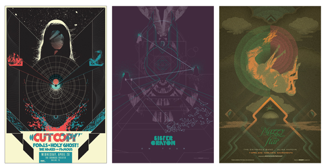
How local graphic designer and poster artist Jason Malmberg came up through the ranks
If you look at a Jason Malmberg poster and you’re unsure at first of what you’re looking at, if you need a minute to stare and process, if things seem off balance, if for a moment you feel like you are looking at a worksheet out of a German school book—don’t be alarmed. This is just the effect the local graphic designer is going for.
In the ‘70s, even public service announcement posters were psychedelic, Malmberg remembers, including one he’ll never forget. It was of a sobbing child throwing his arms over his head in horror, except his arms were 13 or 14 snakes. The poster read, “Why you shouldn’t take LSD” and went on to list what happens in the first 15 minutes, and in the second.
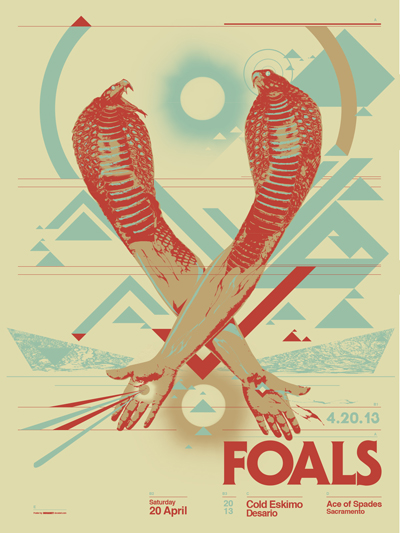
Take a look at the poster Malmberg made for the Foals show at Ace of Spades last month, and in the midst of colliding geometric shapes, you’ll see two intersecting male arms, each turning into the head of a snake from the elbow up.
Malmberg sampled two to four hands, arms and snakes to put together that image alone. “I don’t like hacking on other images,” he explains over the phone from his home office. “I want it to be more my own.”
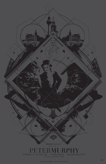
So he salvages bits and pieces from historical images and online library archives public libraries, sometimes drawing on top of them, to recreate entirely new concepts, often with a ‘60s and ‘70s feel. Then he’ll lay out some type—and as a self-proclaimed typography nerd, this is key.
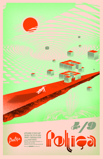
For the last 13 years, Malmberg has designed posters for just under 100 shows, including mainstream acts like Mos Def and the Violent Femmes as well as indie rock band Foals and former underground pop band Luna. Next month, he will showcase some of his pieces in his second-ever poster art show, Modern Lehzure, at Cuffs in Midtown.
Visit Decabet.com and you will get a taste of Malmberg’s work. Yes, decabet, as in Dan Aykroyd’s 10-letter alphabet on Saturday Night Live.
Poster design is Malmberg’s ultimate outlet. What he hasn’t been able to get away with in his day job, he has gotten away with in poster art.
Within the last year Malmberg landed a job with a branding agency in Washington, D.C, where he is now developing his Web skills. Before that, he worked in print, as an art director for a handful of local publications, like Sacramento News & Review, Sactown Magazine and MGW.
While he was with Sactown Magazine, one of his designs popped up on T-shirts at Nordstrom sometime in 2007. You’d never know it, he says, and that’s probably all for the best. Unfortunately, his unique filigree design somehow became a part of the douche bag national uniform, he discloses.
Regardless, life wasn’t always peachy for Malmberg. If anyone has earned the seat they are sitting in now, he certainly has. It took a lengthy series of events to get him here.
To put it bluntly, “I’ve worked every shitty, low-paying job you could imagine,” he says.
This includes working fast food joints, at an eyeglass factory, in furniture assembly and smoothing down edges of windshields for eight hours a day.
Malmberg’s beginnings took place in Omaha, Neb. His teen years preceded Saddle Creek Records.
“It’s still not really cool to be from Omaha, but more than it was when I was there,” he says. “Now Omaha is sort of like a mini Athens kind of city—not Greek obviously—with their hipster cred. I was there in 1999, when it was a terrible wasteland and our claim to fame at the time, which everyone is still trying to live down, is 311.”
He studied under a “hands-off” kind of art teacher in the Omaha suburb of Bellevue, who provided Malmberg with just the right amount of guidance that made him successful. He had gallery shows before graduating from high school and went on to study at the Art Institute of Chicago.
Unfortunately, along with admittance into one of the best art schools in the country came unlimited pretentiousness.
He was surrounded by art students. To his dismay many of them were kids desperately attempting to fit social roles and convince the world they were someone other than themselves.
He quickly came to this realization: “I love people who make art, but I hate artists.”
He also realized that the Art Institute was not for him.
“I was making less art than when I was just a bum working at Taco Bell,” he remembers.
So, a year into it, Malmberg did what many students who find themselves in similar situations don’t have the courage to do—he left.
He returned to Omaha at 19 and began designing T-shirts for his friend’s skateboard gig. It seemed like a good idea at the time he said, but it didn’t last long. Then he took on the factory jobs. After that he spent three years as a rave promoter in Omaha. The last rave he threw was in 1997. It was going to be a huge party, outside. Tons of people were going to be there. This was the one that was going to lift him out of poverty, he thought.
Not quite. But it did result in him getting work laying out classified ads for a small local publication called The Reader. It started out as work to repay a debt. Up to that point he had never used a computer to design.
“I had no idea what I was doing,” he confesses.
The bus only ran twice daily between his place and the office, so rather than go home he would stay all night at the office and teach himself how to design. Eventually he was bumped up to art director.
Within about 18 months he redesigned the publication, drawing national accolades. Sacramento News & Review took notice and offered him a position as art director. He took it, and moved to Sacramento in 1999.
In 2006, he connected with the editors of Sactown Magazine when the publication was in its infancy. He became their art director, and helped create the look of the publication from its inception in 2006 until last year.
It was only a matter of time before he ran into local promoter and legend Brian McKenna in the early ‘00s. Next thing you know, Malmberg was designing posters for local shows on the side.
As his designs have improved he has become more selective about which shows he designs for. If he’s designing a poster for a show, it’s because he’s a fan of the band on the ticket. He doesn’t get paid much, if anything, for his work. He designed the Foals poster out-of-pocket. Hearing back from the band, however, is excellent compensation.
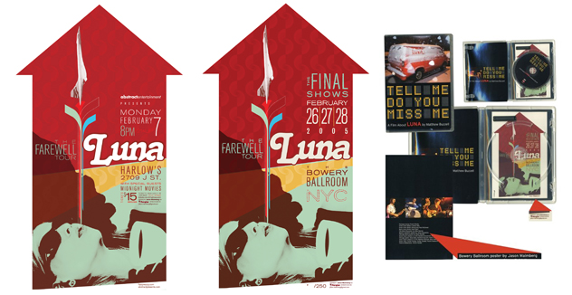
When Malmberg designed a poster for Luna’s show at Harlow’s in 2005, the band liked the design so much they asked to repurpose it as a limited edition sale item for their final show in New York. By the third show they sold out of 250 posters. The following year they used the design again for the DVD cover of their farewell tour.
Regardless of who he designs for, he makes it a point to represent the band properly through his design. For each band poster he designs, he’ll listen to the albums to come up with a theme. Each poster should have its own feel.
“You don’t want to be one of those guys who’s basically just churning out art prints and tacking band names on them, because that’s not cool,” he says. “If the bands don’t sound the same, the posters shouldn’t look the same.
“I don’t try to be literal or narrative,” he says.
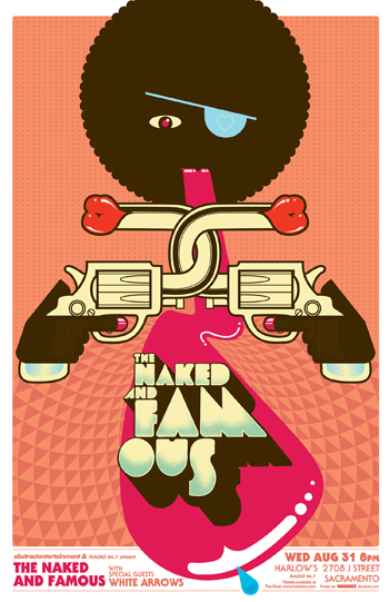
That’s how he ends up with posters that look like German ice cream bar wrappers from the ‘70s, like the one he made for the Naked and Famous show. Both fun and grotesque, what looks like a Reese’s Peanut Butter Cup wags its tongue beneath the noses of two interlinked revolvers.
Malmberg explains the look on his website.
“With the band’s bright candy-colored-yet-tasteful aesthetic in mind, I had the idea to try to make something a little European and a lot of odd,” he says. “I started out wanting to make something bizarre in the Polish movie poster vein but ended up with something a bit more like a German ice cream bar wrapper from the ‘70s. A little pop-art, a little glam, a lot of odd.”
Check out Jason Malmberg’s Modern Lehzure at Cuffs in Midtown (2523 J Street, Sacramento) on May 11, 2013. The event is part of Second Saturday. You can learn more about Malmberg at Decabet.com. While you’re online checking out his rad designs, why not check out Cuffs’ home on the Web at Shopcuffs.com?

Comments