Local illustrator Jonathan Cole Buck Outlines the Varied Facets of his Art
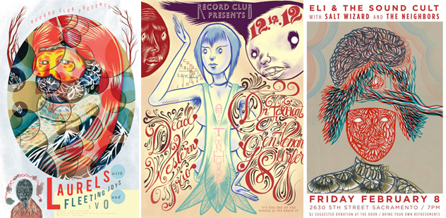
You may have noticed some rad illustrations gracing the cover of the Sacramento News and Review of late, or hanging in windows in the form of show posters. You can thank Jonathan Cole Buck, a local up-and-coming illustrator who is working hard to hone his talent.
Beyond the commissioned work he’s done, Jonathan also creates somewhat disturbing imagery intended for galleries, and comic art that is thought-provoking, tear-jerking and rarely comical. His style continually evolves as he explores through practice and research.
Submerge sat down for an interview with this serious man who has the wisdom not to take himself too seriously, and found the artist to be much more lighthearted than would be expected after viewing his work.

When did you start illustrating?
For money, last year, but I’ve been drawing all my life. I tend to gravitate toward those things that I’m just naturally good at, and getting attention for something you’re good at helps boost your interest in it. The better I get at it, the more I realize not to take it seriously and just to have fun with it.
The first one I got that was paid for was last year. I got an inside illustration about DJs, how they’re dying out. I had to write out a W-4 and everything, so that was cool.
I do feel a little conflicted about having to do exactly what someone else wants [in order to] to get paid, so lately I’ve been a little loosey goosey and have been doing some abstract stuff.
Who are some of your inspirations?
Marcel Duchamp, Eva Hesse, Pablo Picasso and modern illustrators like James Jean, Daniel Clowes (who wrote Ghost World) and Chris Ware.
You mention on your website having pursued a number of majors without having ever completed a program course. Of all your interests, is illustration your primary interest, or are you pursuing other creative endeavors, too?
I kind of want to do everything. Everything is so interesting and fun. It’s hard to focus on one thing. It would be a really boring life to follow one pursuit. I got a scholarship for poetry initially, and started with a journalism program. I used to play in punk bands, until the scene got emo and I split for obvious reasons.
Describe the spectrum of illustration you do.
Right now I’m afraid that I’m pigeonholed into a style that looks like a graphic novel style. I really want to do abstract stuff.
Your comics aren’t usually very funny. They tend to be melancholy. Who are your comic art inspirations, and have any of your comics been published?
I haven’t published any comics; I’m terrified to show people a lot of them. I am working on a graphic novel based on a short story. I keep redoing it because once I get to the 15th page, my style has changed. I might end up abandoning the project and doing something that’s less serious. My favorite comic book illustrators are Sammy Harkham and Will Eisner.
Where can people view your art in upcoming shows?
I have a show at Insight Coffee Roasters beginning on Dec. 7—it’ll be up ‘til Jan. 2. Then at Tomato Alley Gallery, right across from La Garnacha—I have a couple pieces in there. The closing reception is Dec. 14. After that, I’ll be searching around galleries to see about group shows.
Where do you want to take your art career?
I enjoy art, but making it a career seems unlikely as it seldom pays the bills. I will always make things as I enjoy it more than anything else. If an illustration or fine art career blossoms somewhere down the road, it will just be a happy accident to a continuous activity that I already compulsively do. It is likely that I will end up doing some sort of animation, writing or film work, as that can pay the bills a bit better, and it’s something I’m interested in. But who knows. I can’t really predict the future. At my most optimistic, delusions of grandeur and all, I would prefer to be running my own media company and hire all of the people who have helped me along the way. At worst I suppose I would be working as a waiter somewhere, which isn’t really that bad.
Describe some of your work, and the thinking and technique behind these pieces.
Jealous Guy
 As far as inspiration goes for this piece, I think I was looking at a lot of illustrators that are notorious for being problem solvers, often shapeshifting two concepts to further the main idea. I bought the frame at a thrift store, which constrained the dimensions I would be working in to a long and slender shape. I pulled an image I had in a sketchbook from a year ago that I had been meaning to use and went with it. I penciled it out on alpha rag matte board that I often buy from the framing section at University Art. It is archival and takes most media extremely well as long as you don’t make mistakes. After I used watercolor to gradient the background I blocked in the main character with Holbein’s acryla gouache and inked the piece entirely with Speedballs scarlet acrylic ink. I went back and did some negative shading with a 6B pencil to make the characters a little more interesting.
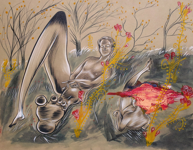
Luncheon in the Grass
This is my favorite and probably the best piece I’ve made. I was looking at a lot of Manet at the time and thought it would be cool to ride off an idea and make it weird. It was a title of the same Manet piece Le déjeuner sur l’herbe. I drew about 10 thumbnails before I penciled it on matte board. I had to mix my own inks to get the right color of blue for extreme opacity at minimal viscosity so it would be ideal for inking with a brush. Once I got that done, I sort of just went with it. Once I have a plan, I work extremely fast.
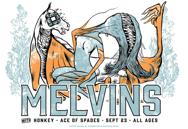
Melvins Poster
I got the go-ahead for doing the poster from the promoter (Brian McKenna). I have always wanted to work with Laura Matranga so I sent her a line about doing a screen print for the project. She was stoked. I took the main image directly out of a sketchbook and showed it to Laura. She thought it would be a good fit for the vibe of the band, so she started setting up the layers and colors for transfer into screen-print. This was my first time screen-printing and Laura was extremely general in walking me through the process.
Two-Face
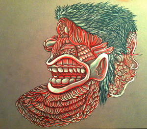 I did this while working concessions at Tower Theatre. There was a lot of downtime at that job, and I took full advantage. I am somehow surprised that popcorn butter did not make its way into this piece. I used ink and just sort of brushed it in as fast as I could in between customers. I then used pencil to set contrast in the shadows.
See more of Jonathan Cole Buck’s work at Nannerfish.wordpress.com, or at Insight Coffee Roasters and Tomato Alley Gallery this month.
Comments